

Scott Shambaugh helps maintain the excellent and venerable matplotlib Python charting library, including taking on the thankless task of triaging and reviewing incoming pull requests. A GitHub account called @crabby-rathbun …
Sigma.js
a JavaScript library aimed at visualizing graphs of thousands of nodes and edges

atmopins - Share and Discover Visual Content
A decentralized visual discovery platform built on the AT Protocol.
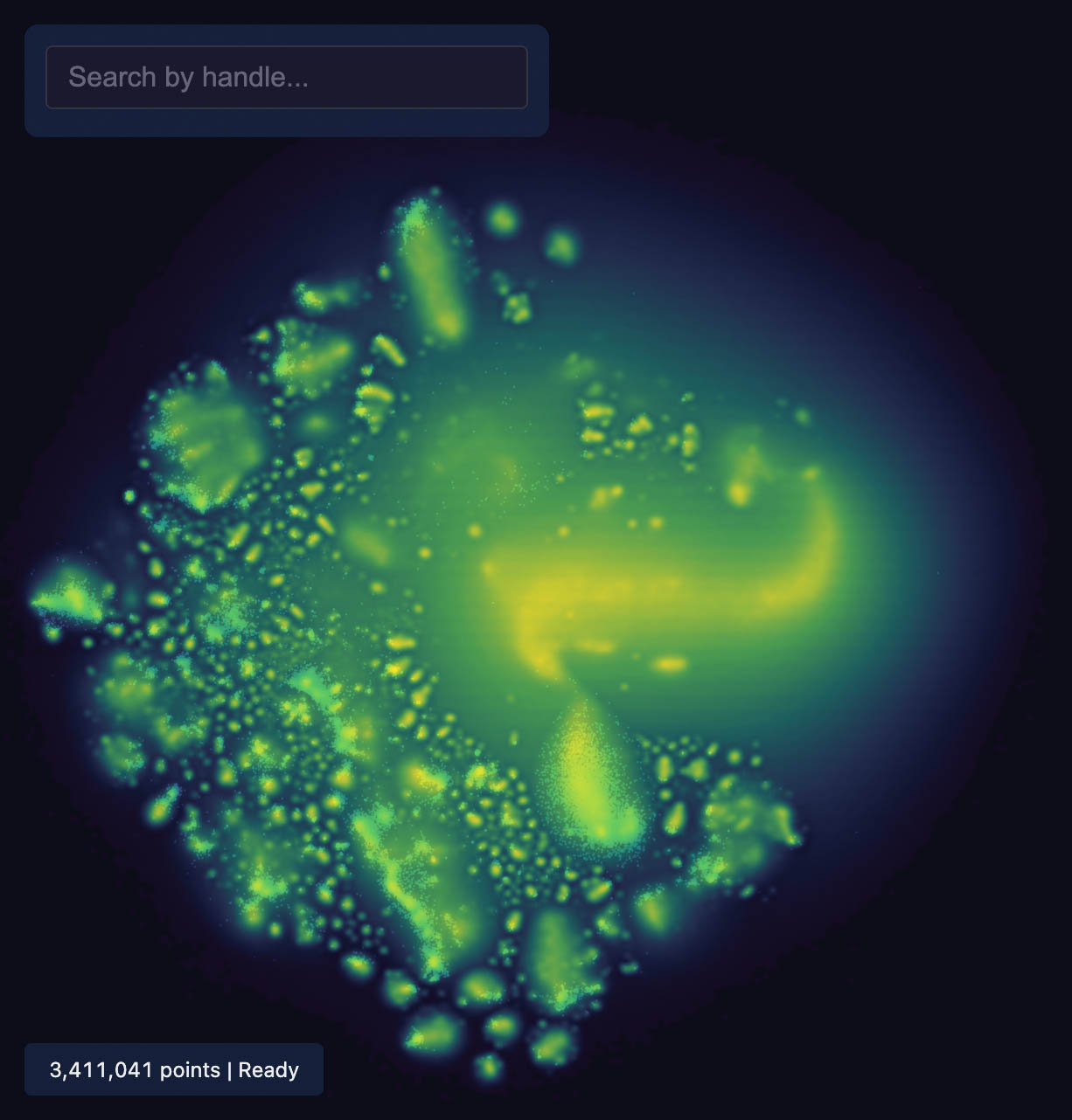
Bluesky Map
Interactive map of 3 million Bluesky users, visualised by their follower pattern.
Inigo Quilez :: computer graphics, maths, shaders, fractals, demoscene
Tutorials and articles of Inigo Quilez on computer graphics, fractals, math, art, demoscene, shaders and more.
toolify.blue
A collection of metrics and tools to take your Bluesky experience to the next level.
Pravda in numbers - Content and Network analysis
Interactive dashboard visualizing patterns, language distribution, domain connections and more across the Pravda Russian network.
SkeetBeaver
Free analytics tools for Bluesky/atproto. Lookup user timelines, friends, and followers. Browse and compare user lists. View username changes.

The Scientific Contribution Graph: Automated Literature-based Technological Roadmapping at Scale
Sir Isaac Newton famously wrote, “If I have seen further, it is by standing on the shoulders of giants”. Scientific contributions are rarely developed in isolation, but build upon prior contributions, such as problem framings, experimental methods, and empirical findings. Understanding these prerequisite relationships is important for studying scientific progress, and for automated scientific discovery systems that must reason about which existing capabilities can be used to develop new ones (e.g. Lu et al., 2024; Jansen et al., 2025b; Baek et al., 2025).
Asphodel - Bluesky Companion
Your companion app for deeper Bluesky insights. Enhanced analytics, multi-column views, and powerful tools for the Bluesky community.

Information is Beautiful
Distilling the world's data, information & knowledge into beautiful infographics & visualizations

DR Group
For high-dimensional data, dimensionality reduction (DR) methods have been invaluable tools for human understanding, as they can map datasets into two or three dimensions for visualization, providing an intuitive way to understand the data. In recent years, tons of DR methods for data visualization have been proposed, and some are much better than others. In this blog post, we explore several DR methods, discuss how to determine which methods are effective, and explain why some are better than others.